#65 | NetSuite Customizing Dashboard Portlet

NetSuite allows users to customize the dashboard using portlets. This feature is a great way for you to easily look at a glance the reports and other business-related KPIs that are most important to you. Having the highlights or high-level reports you need in one place will definitely save you time.
Here, you will learn the following:
I suggest you watch the video. It’s easier to understand if you are a visual/audio learner. The content below is the same as the video. It’s for those who learn by reading.
What are NetSuite Portlets?
If you’re not sure what the portlets are in your dashboard, they are the square sections that show data fields or graphs as shown in the image below.
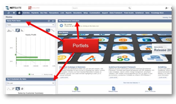
The dashboard can be customized based on what information you need and tailor it to fit your daily tasks and how you work. You can add, remove, or rearrange the portlets in your dashboard.
If you want to see your portlet trend, you can put it in the dashboard so that every time you go to home in NetSuite, it is right there.
Moving Portlets
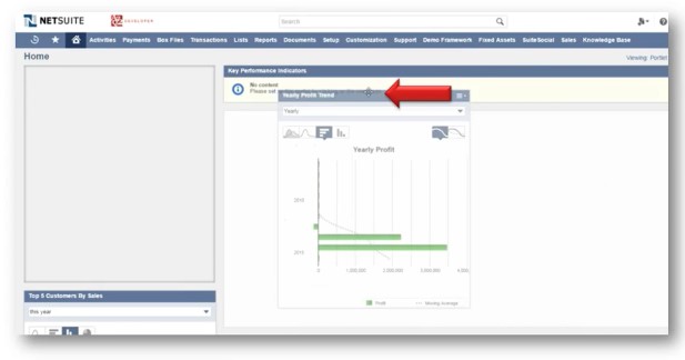
Here are three simple steps for how to move the portlets.
- Go to the bar and locate the move button. The move button has four arrows pointed outward.
- Hold the move button in the bar while dragging it.
- Position it anywhere in the dashboard.
Removing Portlets
The next images will show you how different portlets are removed.
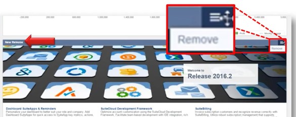
First example is the portlet showing a new release of NetSuite. If you don’t want to see this, just follow these quick and easy steps.
- Go to the top right corner.
- Change the settings to remove the portlet.Customizing Portlet Graph Setting
Shown here is the portlet with the top five customers by sales. You can change the graphs displayed by clicking on the dropdown menu and selecting which graph types or periods to view.
- Hit remove, and it’s gone.
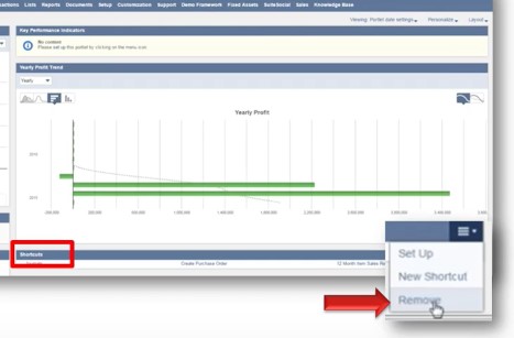
The next example is the shortcut portlet similar to the shortcut button in the navigation bar.
To remove it, just follow these steps.
- Go to shortcuts.
- Select remove.
- Check the dashboard to see that it’s gone.
Customizing Portlet Graph Setting
Shown here is the portlet with the top five customers by sales. You can change the graphs displayed by clicking on the dropdown menu and selecting which graph types or periods to view.
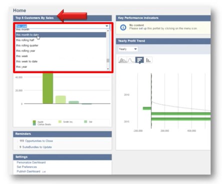
Let’s take a look at two different graph selections below.
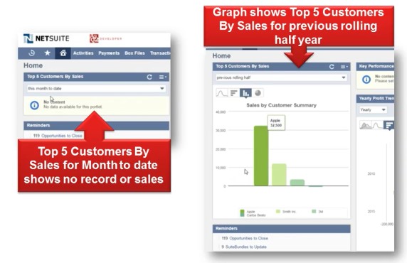
- Left Graph – the top five customers by sales for month-to-date with no record
- Right Graph –the top five customers by sales for the previous rolling half year with record
In the right graph, you’ll also see different visual options such as line, vertical, or horizontal bar, and pie graphs to display your data. Just choose which one will best represent your data.
Summary
To recap, you have just learned how to do the portlet customization.


Leave a Reply